
A little colour confidence
What Colours Go Well Together? 8 Home Colour Palettes
Find a combination you love, then bring it home through furniture, artwork and the little finishing touches.
- Cream
- Warm beige
- Taupe
- Soft black
Ever brought home a cushion, vase or artwork you loved, then wondered why it looked a little different beside everything else? Choosing colours can feel simple until you start putting the pieces together.
What colours go well together at home? Cream with beige and taupe, sage with oatmeal, blue with sandy neutrals, and terracotta with olive are all combinations you can try. The exact shades, how much of each you use and what is already in your room will shape the result.
Before you choose your colours
You do not need to begin with an empty room. First, look at the largest surfaces and pieces: the walls, flooring, sofa, cabinetry and any furniture you plan to keep. Their colours already form part of your palette.
Compare undertones. An undertone is the subtle colour sitting beneath the main shade. Two whites can look similar separately, then one looks creamy and the other cooler when you place them together. Compare your samples beside each other and beside your existing furnishings.
Check the light. Look at fabric and paint samples in the actual room during the day and with your lamps on. A combination you like on a screen may look different at home.
For a softer blend
Try different depths of one colour, or neighbouring colours on the colour wheel, such as blue and blue-green.
For more contrast
Try colours from opposite sides of the wheel, such as blue and orange. Muted versions can make the contrast easier to introduce.
8 colour palettes to try at home
These eight combinations are starting points you can adjust to your own room. Choose the exact depth of each shade to suit the furniture, finishes and light you already have.
The swatches are digital colour references, rather than paint codes or product colour matches. Check physical samples in your room before choosing a finish.
Cream, warm beige and taupe
Soft, layered neutrals
- Cream
- Warm beige
- Taupe
- Soft black
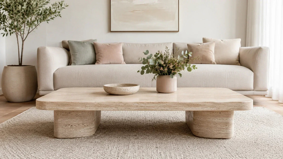
If you love a neutral home, try a few shades with different depths rather than making everything the same beige. Cream gives this palette a light starting point, taupe adds definition and a small touch of soft black outlines the room.
Try it at home: Try a cream sofa, a warm beige rug and taupe cushions. Add a dark picture frame or lamp, then vary the textures with linen, woven fibres and a ceramic bowl.
A little styling note: Try this if your neutral room feels a little flat. Add texture and a darker detail before adding more furniture.
Sage green, oatmeal and light oak
Gentle colour with natural texture
- Sage green
- Oatmeal
- Warm white
- Light oak
Sage is a lovely option when you want some colour without a very bright finish. Pairing a muted green with oatmeal and light timber makes it easy to introduce through a few pieces rather than changing the whole room.
Try it at home: Start with an oatmeal lounge or bedspread, then bring in sage through a cushion, throw or artwork. A light oak side table and warm white ceramics can carry the same palette into a nearby reading corner.
A little styling note: Look at the green beside your timber. A soft grey-green and a yellow-green will give you quite different results.
Dusty blue, sand and warm white
An easy coastal combination
- Dusty blue
- Sand
- Warm white
- Deep blue
For a coastal feel, try a softened blue beside sandy neutrals. The pale shades leave plenty of breathing room, while a deeper blue accent gives the arrangement a little more shape.
Try it at home: Layer blue cushions on a warm white sofa, add a sandy rug and choose a print that repeats both colours. Timber, rattan or a woven basket can help the room feel relaxed without needing lots of beach-themed decorations.
A little styling note: Choose one deeper blue detail, such as a vase or a frame, if the pale colours are disappearing into each other.
Terracotta, olive and cream
Earthy colour with a little depth
- Terracotta
- Olive green
- Cream
- Warm taupe
Terracotta brings a warm clay colour into the room, while olive gives you a quieter green to sit beside it. Keep cream as a generous background if you would like the combination to feel light rather than very rich.
Try it at home: Try terracotta cushions on a cream sofa, an olive throw and a simple clay-coloured pot. A warm timber table can sit comfortably in the mix. Begin with the smaller pieces so you can adjust the balance as you go.
A little styling note: Let either terracotta or olive lead. Using equal amounts of both can create more contrast than you intended.
Dusty blush, warm grey and soft white
A softer take on grey
- Dusty blush
- Warm grey
- Soft white
- Charcoal
A muted pink can be a pretty addition to a grey room, especially when you want colour in small amounts. Soft white keeps the palette simple, and a charcoal detail adds a clear edge.
Try it at home: Add a dusty blush cushion or print to a warm grey sofa. Repeat the pink once elsewhere, perhaps in a little bowl or a throw, and keep the larger surrounding pieces fairly quiet.
A little styling note: Check the grey you already own. A grey with a blue cast may suit a cooler pink better than a peachy blush.
Olive, caramel and ivory
Warm and grounded
- Olive green
- Caramel
- Ivory
- Espresso
This is a useful palette to try if you already have tan leather, brown upholstery or darker timber. Olive introduces another colour, while ivory gives the deeper shades some space.
Try it at home: Place an olive cushion on a caramel lounge and add an ivory throw. Repeat a dark brown tone through a frame or small table, then choose artwork with a little green to connect the pieces.
A little styling note: Before choosing a large new piece, put the fabric or finish sample beside your existing brown furniture.
Charcoal, stone and pale oak
Simple contrast for everyday spaces
- Charcoal
- Stone
- Pale oak
- Cream
Charcoal and stone give you a clear light-and-dark starting point. Pale timber and cream can soften the overall arrangement, particularly if you already have a dark sofa or black furniture legs.
Try it at home: Layer stone cushions and a cream throw on a charcoal sofa, then add a pale oak coffee table. Try a woven rug or textured curtains if the room has lots of smooth or shiny surfaces.
A little styling note: With a dark sofa, repeat a small dark detail elsewhere so it feels connected to the rest of the room.
Bring your palette into the room
- Choose your anchor. Pick a piece or surface that is staying. A favourite artwork is especially handy because it can already contain two or three colours you enjoy.
- Let one colour take up more space. It might be the walls, a large rug or your sofa. You do not need to use every colour in equal amounts.
- Add a supporting shade. Bring it in through a smaller piece of furniture, curtains or bedding. Look for a connection to the anchor rather than an exact match to everything.
- Repeat an accent. Try it in two small places, such as a cushion and an artwork detail. The repetition can help the pieces feel connected.
- Step back and edit. Move things around, take a photo and give yourself a little time before buying more. Sometimes changing one cushion cover is enough.
If you are refreshing a few rooms, repeat one or two colours or materials between them. They can have different personalities while still sharing a little connection.
Your colour matching questions
What colours go with a beige sofa?
Sage green, dusty blue, olive and terracotta are all options to try. Cream and taupe can create a quieter look. Compare the colour beside your actual sofa, because beige can have a yellow, pink or grey undertone.
What colours go with a grey sofa?
Try soft white and charcoal for a simple combination, or add dusty blush, blue or green. First check whether your grey looks warmer or cooler, then compare a few fabric samples in the room.
Can I mix warm and cool colours?
Yes. You might try a blue cushion beside a tan sofa, or olive accessories with terracotta. Let one colour lead and use the other in smaller amounts, then judge the combination in your own light.
What is an easy bedroom colour combination?
For a softer-looking bedroom, try sage with oatmeal and warm white, or dusty blue with sand. Start with bed linen and a small accent so you can see whether you enjoy the palette before changing larger pieces.
Do all the rooms in my home need to match?
They can be different. Repeating a neutral, a timber finish or an accent colour across nearby spaces is one way to connect them. You can change the amount of that colour to give each room its own feel.
Find something for your home